Customize Appearance
This article is applicable for V1.10 and later for LI PASS for client, and LI PASS for Web.
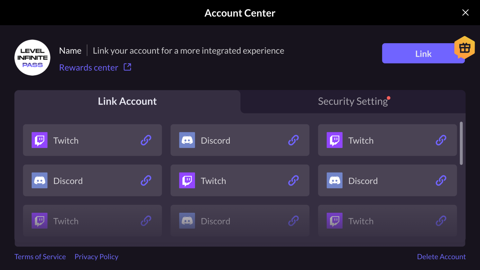
LI PASS provides standard UI templates for quick integration into your projects. Appearance customization is also supported, allowing you to keep the style of LI PASS components consistent with the design of your project.
Follow the procedures in this article to implement appearance customization for your game client or Web.
UI Templates

Customize appearance for game client
Step 1: Prepare UI resources
Use the LI PASS UI Editor from Player Network to prepare UI resources, to fulfil your basic customization needs for the LI PASS login panel, see Basic customization for more information regarding the customizable elements.
After finalizing the customizations in the LI PASS UI Editor, UI resources for the client can be exported directly from the editor.
Since LI PASS V1.16, advanced customization of the UI is also supported, see Advanced customization for more details.
Step 2: Replace resources
- Unity
- Unreal Engine
Submit the UI resources to the Player Network team, and a customized AssetBundle will be provided in return. The AssetBundle should be placed within the StreamingAssets/LevelInfinite directory.
-
Submit the UI resources to the Player Network team, and the customized resources will be provided in return, which includes:
- Skin images:
Textures/Skin - Text color configuration:
Lua/LevelInfiniteFontStyle.lua
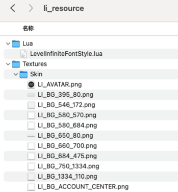
- Skin images:
-
Put the resources in the
li_resourcedirectory at the same level as the game project root directory.
-
Batch import resources.
Contact the LI PASS contact to obtain the Python script, then execute the following commands.
#Only replace the font.
python3 ./LITools.py -t ReplaceLIFont

#Replace the image, country list, and text style.
python3 ./LITools.py -t ReplaceSource

#Replace the image, country list, text style, and font.
python3 ./LITools.py -t ReplaceAllSource -
Verify whether the resources in
Plugins/LevelInfinite/Content/INTLGameNative/LevelInfinite/Textures/Skinhave been updated in the editor. The resources found underli_resourceshould now appear within thePlugins/LevelInfinite/Content/INTLGameNative/LevelInfinite/Textures/Skindirectory.
Step 3: Verify resources
Run the game in either the editor or on a real device to verify whether the UI has changed as expected.
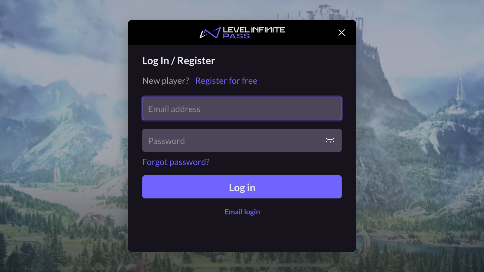
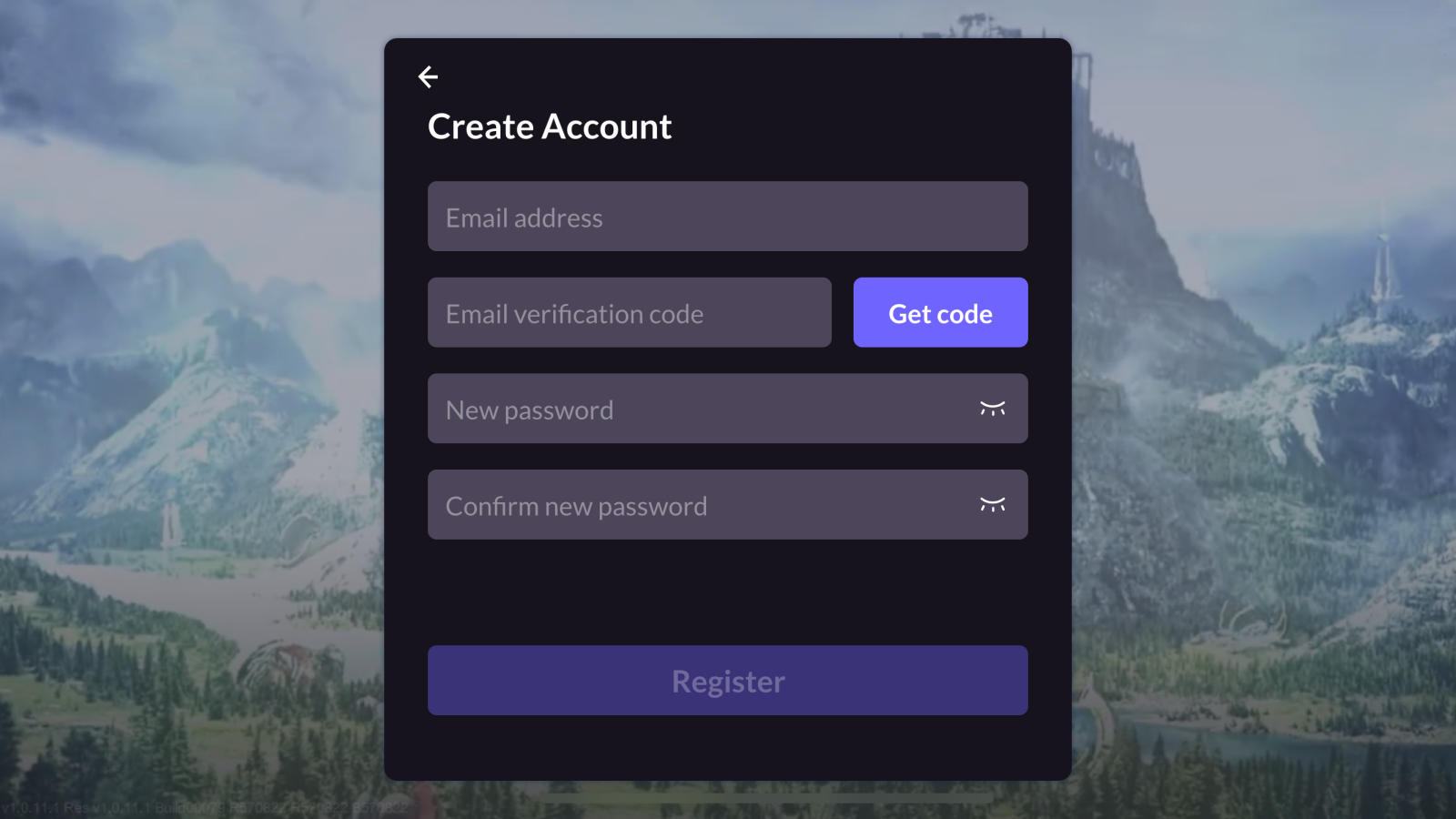
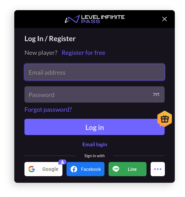
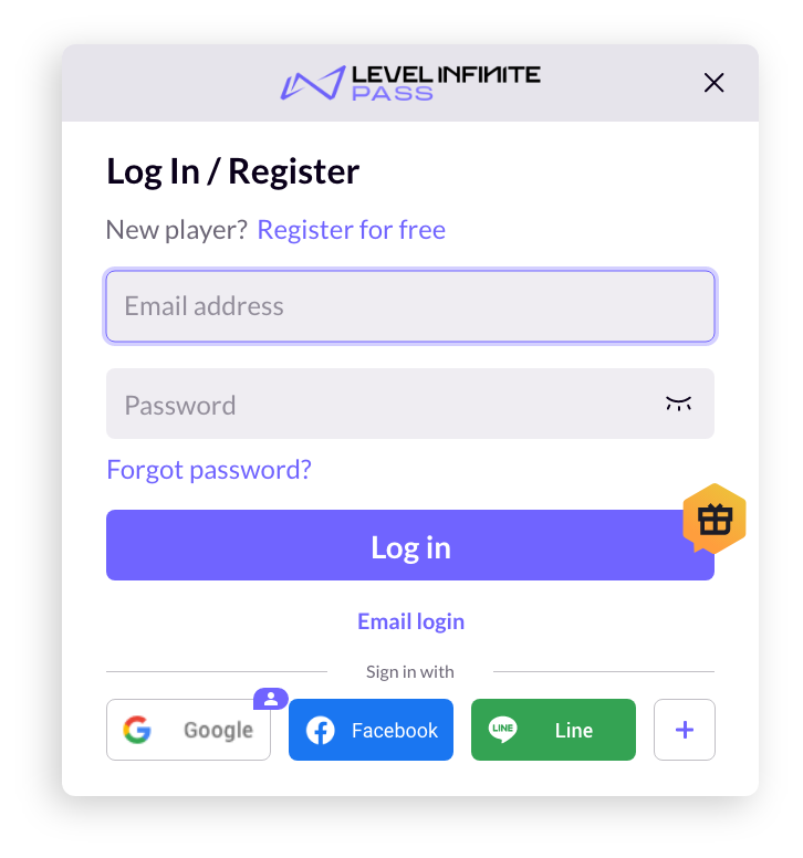
For instance, the standard LI PASS UI, which is initially set to dark mode has been updated to light mode.
Dark mode:
Light mode:
Customize appearance for Web
Step 1: Obtain configuration parameters
-
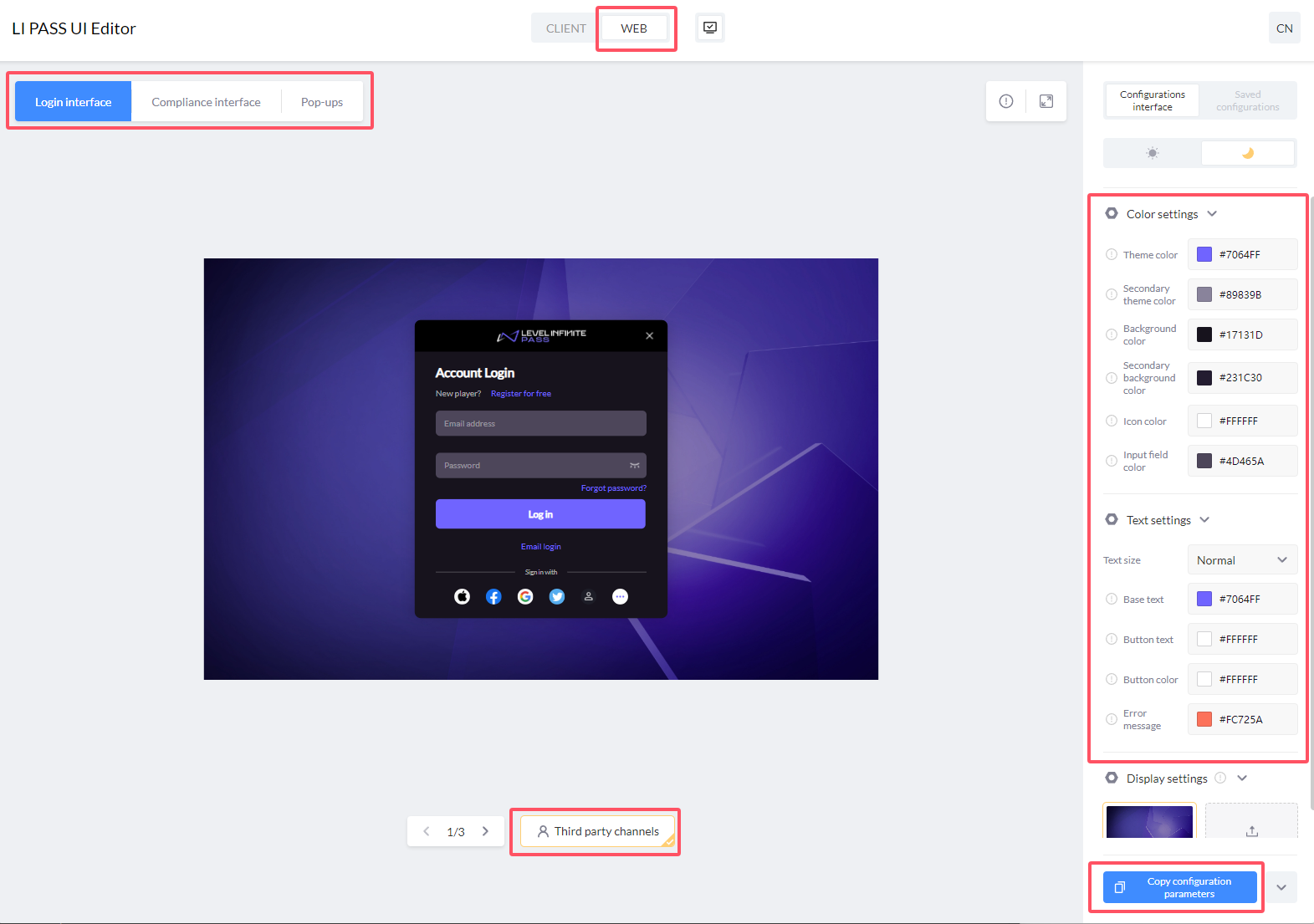
From LI PASS UI Editor, select WEB.
-
Modify the configurations on the right, and preview the results for Login interface, Compliance interface, Pop-ups. Dark and light color schemes are provided by default.
-
Click Copy configuration parameters when done.
Sample:
{
    token: {
        colorPrimary: "#7064FF",
        colorSecondary: "#89839B",
        colorPrimaryBg: "#17131D",
        colorSecondaryBg: "#231C30",
        colorIcon: "#FFFFFF",
        colorInput: "#4D465A",
        fontSize: "MD",
        colorPrimaryText: "#ff6666",
        colorTextBase: "#FFFFFF",
        colorTextButton: "#FFFFFF",
        colorError: "#FC725A",
    },
    algorithm: "dark"
} -
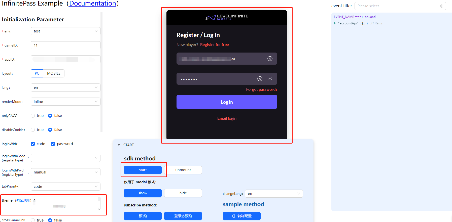
[Optional] The copied parameters can be tested at Component example.
- Paste the copied theme into the
themeproperty input box. - Click start to begin previewing.
- Paste the copied theme into the
Step 2: Configure widget parameters
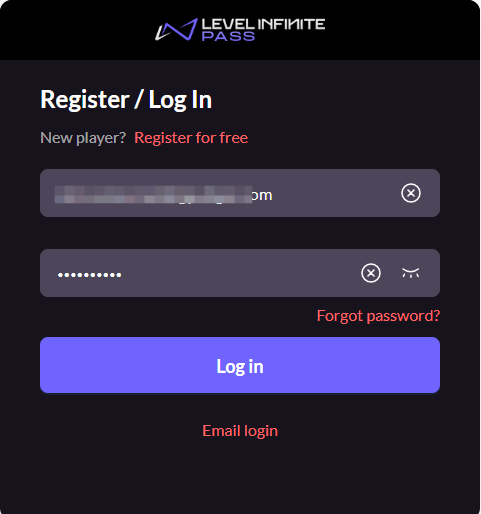
Configure the parameters in the widget config, under the theme property.
Sample:
// Load widget resources
<script src="https://common-web.intlgame.com/sdk-cdn/infinite-pass/latest/index.umd.js"></script>
<link rel="stylesheet" href="https://common-web.intlgame.com/sdk-cdn/infinite-pass/latest/index.css" />

// Input configuration and theme parameters
const newPass = new PassFactory.Pass({
    env: 'test',
    gameID: 11,
    appID: '0afef39eb02d069107db6e02efd71a2c',
    config: {
        langType: 'en',
        theme: {
            token: {
                colorPrimary: "#7064FF",
                colorSecondary: "#89839B",
                colorPrimaryBg: "#17131D",
                colorSecondaryBg: "#231C30",
                colorIcon: "#FFFFFF",
                colorInput: "#4D465A",
                fontSize: "MD",
                colorPrimaryText: "#ff6666",
                colorTextBase: "#FFFFFF",
                colorTextButton: "#FFFFFF",
                colorError: "#FC725A",
            },
            algorithm: "dark"
        },
    },
});

// Mount pass component
newPass.start('#infinite-pass-component');
Basic customization
Basic customization is supported since V1.10 for LI PASS for client, and for LI PASS for Web.
Basic customization includes the modifying of image colors, and text sizes and colors.
Image colors
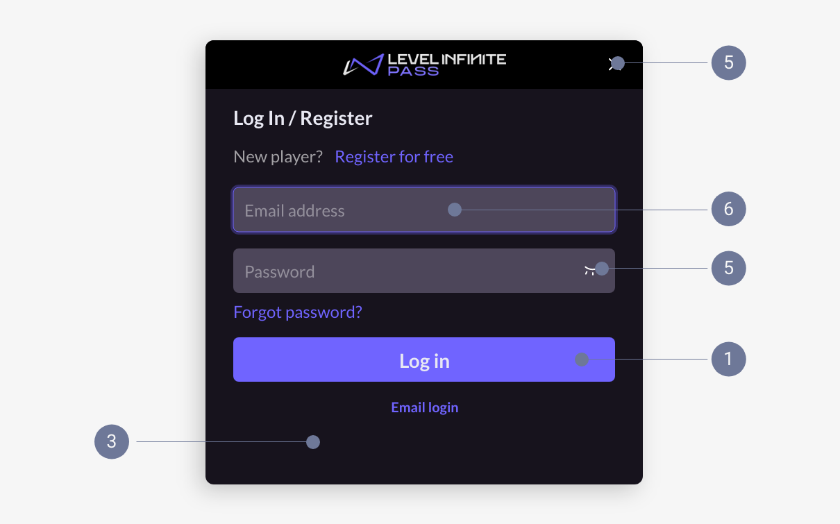
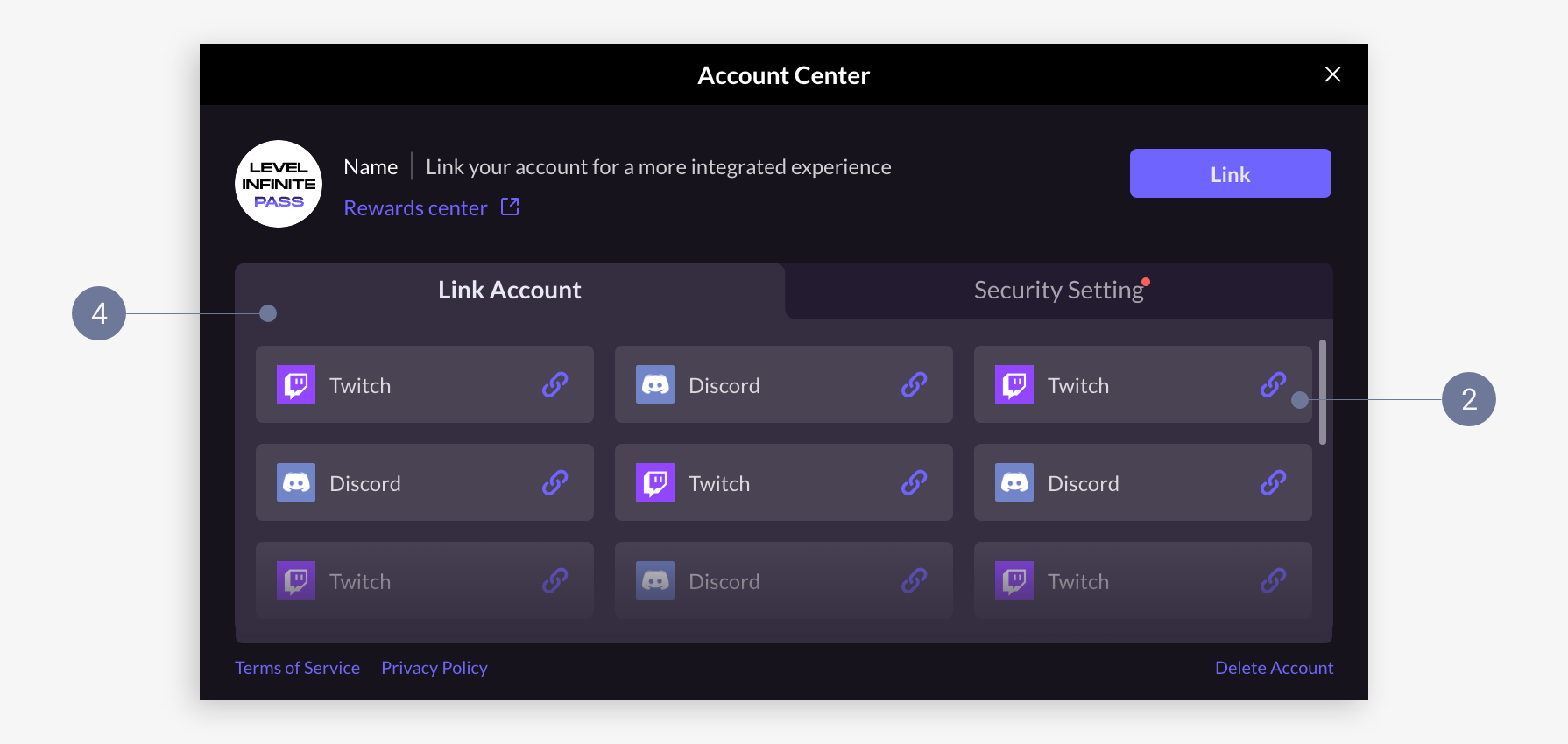
- Theme
- Secondary theme
- Main background
- Secondary background
- Icon
- Input box
Text colors
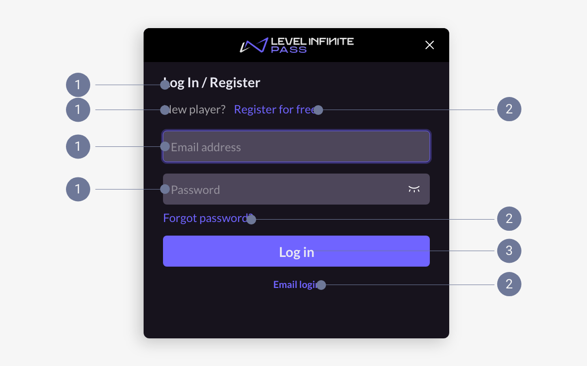
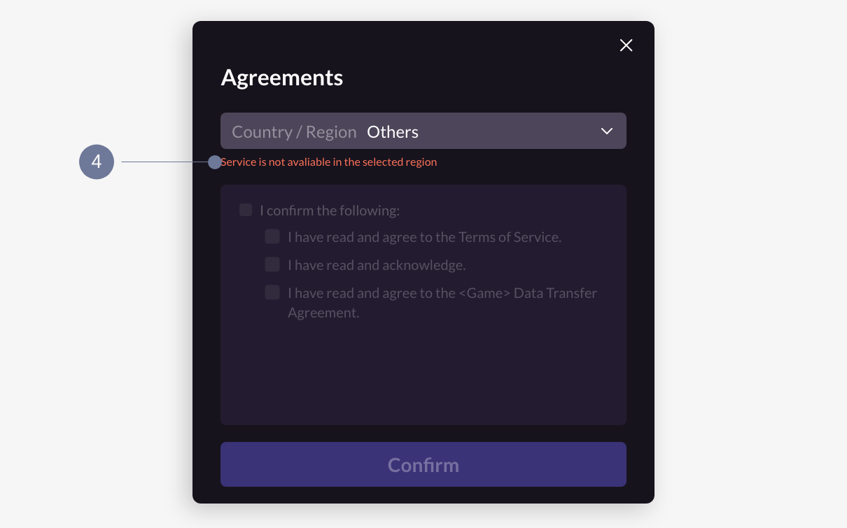
- Body text
- Text button
- Image button
- Error message
Advanced customization
Advanced customization is supported since V1.16 for LI PASS for client. LI PASS for Web only has support for basic customization.
If basic customizations does not meet your game's stylistic requirements, you may choose to manually replace image resources for more advanced customizations.
Due to the variations in image resources across LI PASS versions, reach out to the Player Network representative for more information about the image specifications.
This section covers the available styles for each image type. To learn more about image resizing, see Image processing techniques.
Login panel
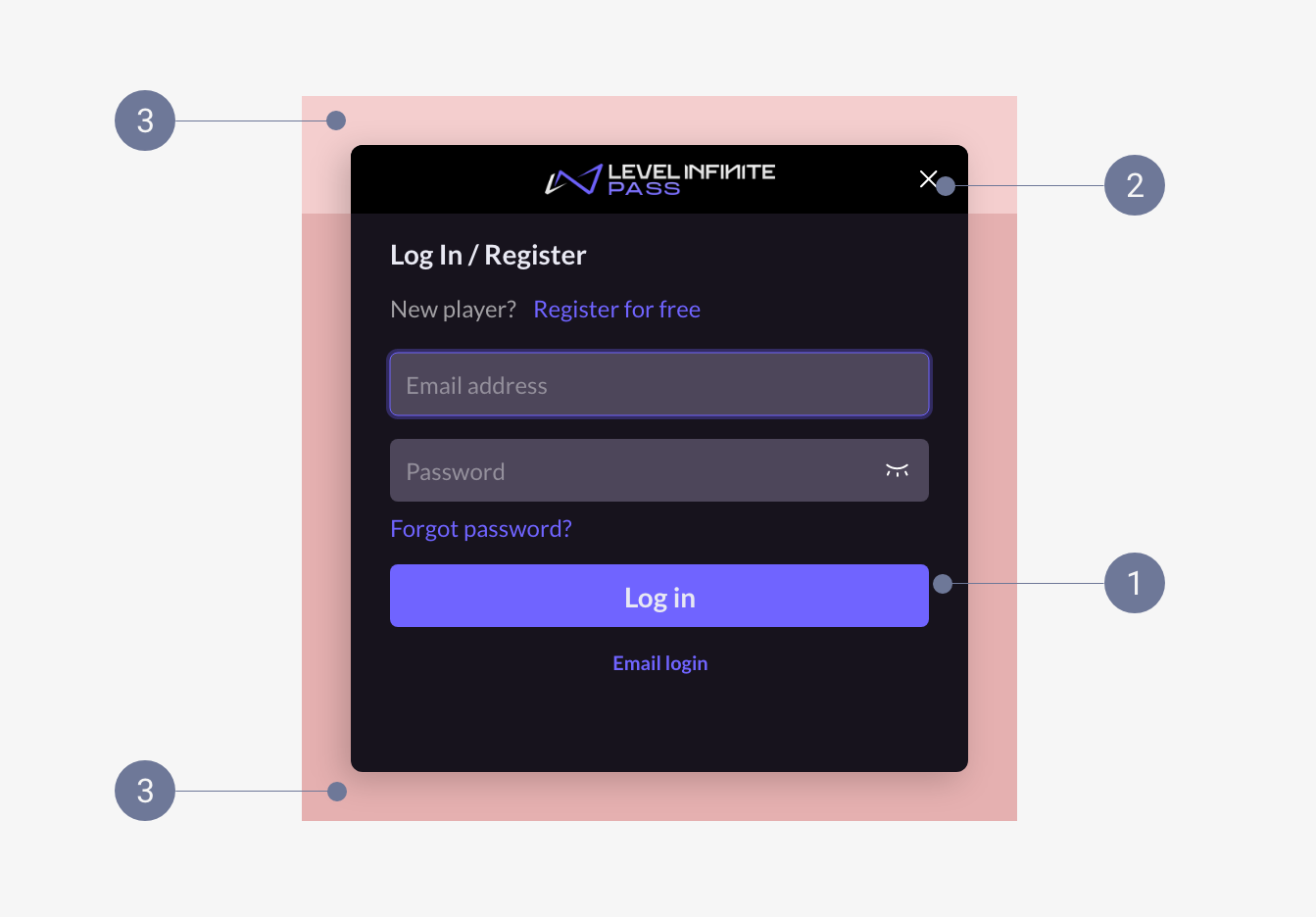
- Main background: Style should be consistent with the main background of the popup, but sizes can differ. Can include patterns, and is resized through proportional scaling.
- Title bar background: Can include patterns, and is resized through 9-slice scaling.
- Exterior pattern area: Resized through 9-slice scaling.
Examples
Main background:
Main background pattern:

Title bar background:
Title bar pattern:
Exterior pattern (main background):

Exterior pattern (title bar):

Popup
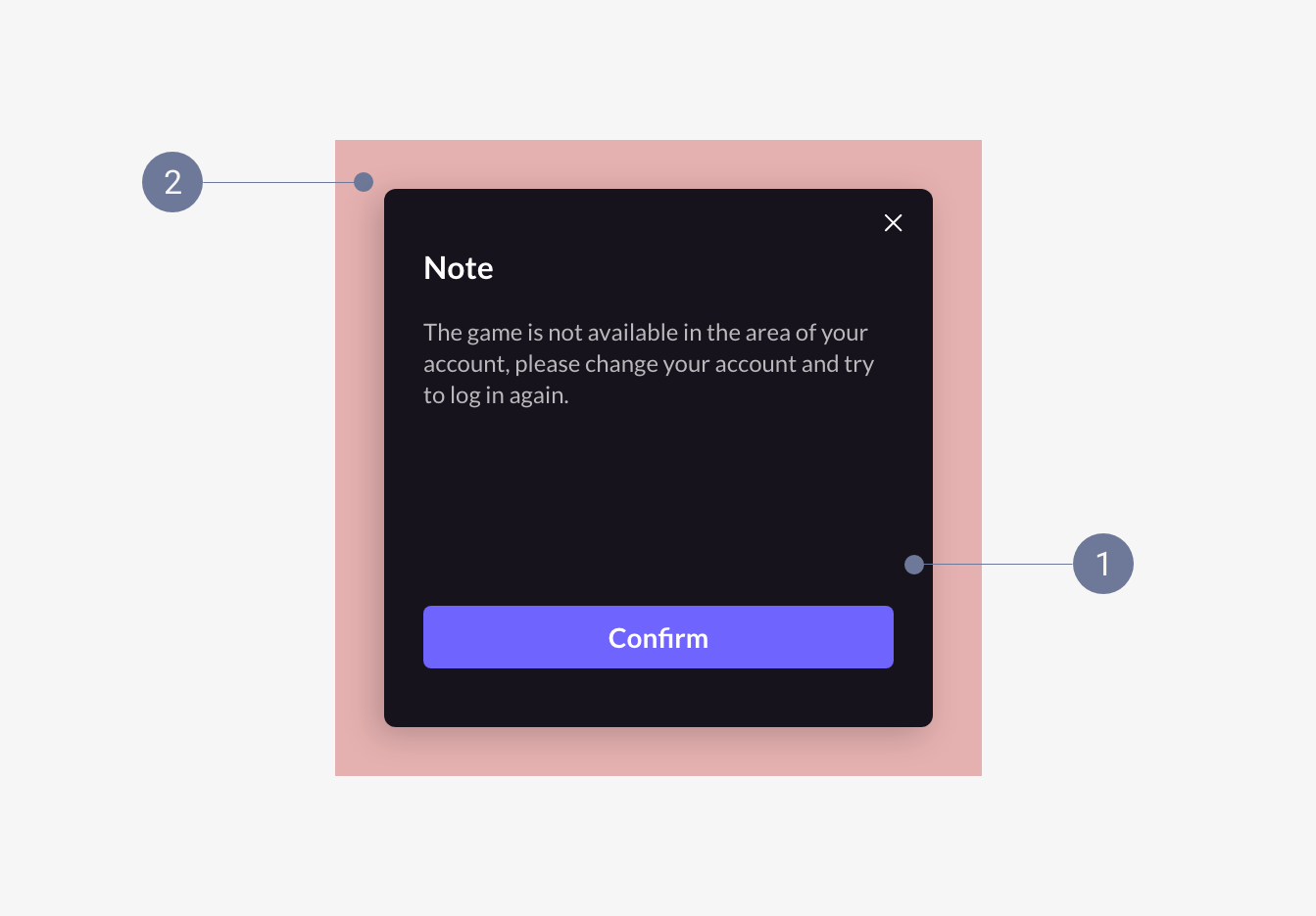
- Main background: Style should be consistent with the main background of the login panel, but sizes can differ. Can include patterns, and is resized through proportional scaling.
- Exterior pattern area: Resized through 9-slice scaling.
Examples
Main background:

Main background pattern:
Exterior pattern:
Account Center
The Account Center is displayed in full screen for mobile, and as a popup for PC.
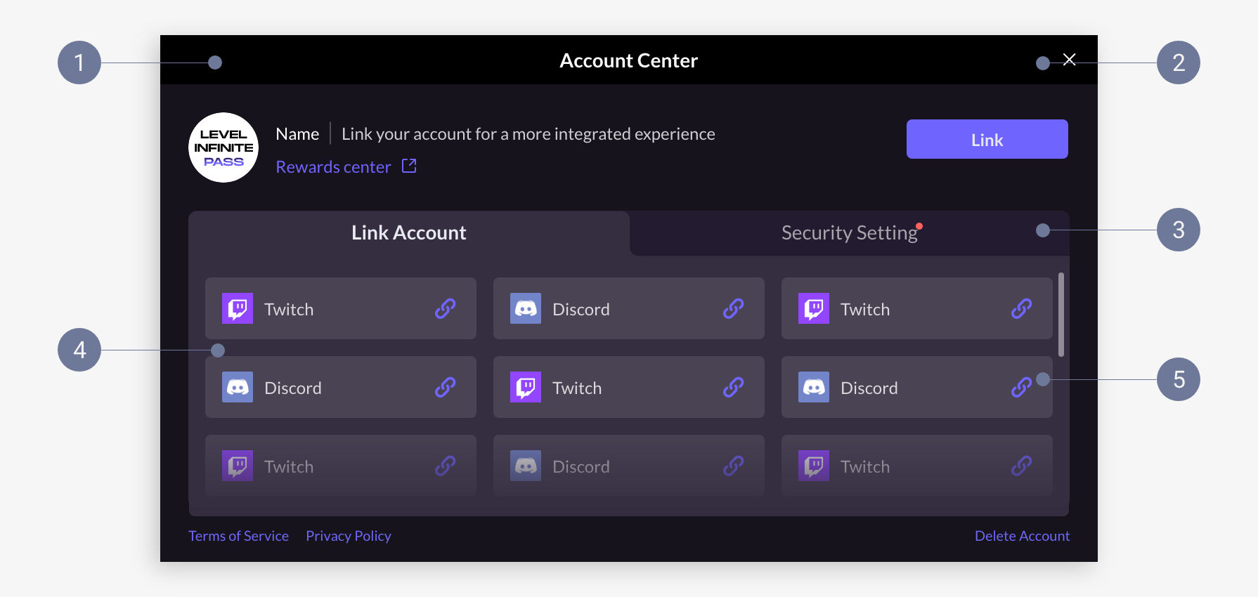
- Mobile
- PC
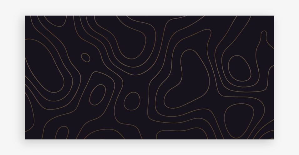
- Main background: Can include patterns, and is resized through proportional scaling.
- Title bar background: Style should be consistent with the title bar background of the login panel. Can include patterns, and is resized through 9-slice scaling.
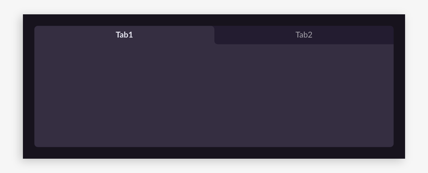
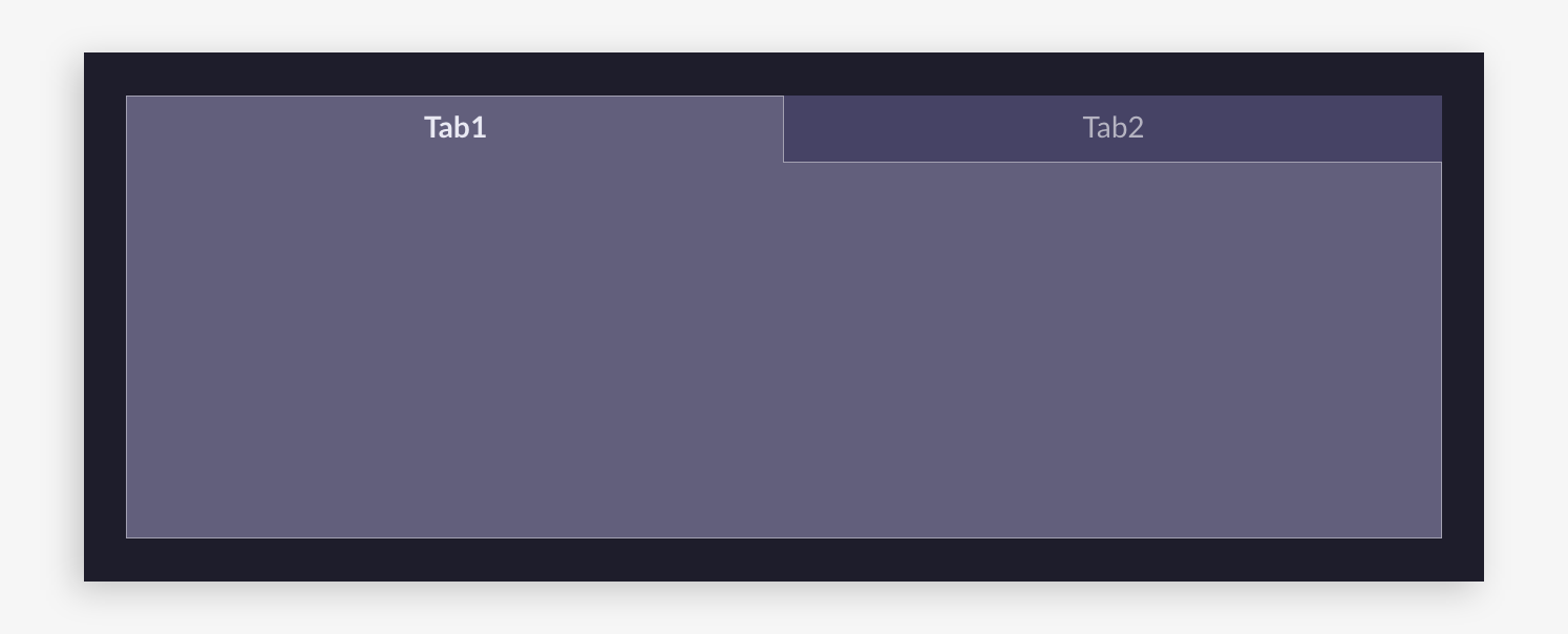
- Tab background: Consists of Tab 1 and Tab 2, where Tab 1 (selected tab) is vertically adjacent to the content background. Color and corner radius can be adjusted, and is resized through proportional scaling.
- Content background: Color and corner radius can be adjusted, ensure that the top corners match the tab background when adjusting corner radius. Resized through 9-slice scaling.
- Card background: Color and corner radius can be adjusted, and is resized through 9-slice scaling.
- Main background: Uses image resources of the main background of the login panel.
- Title bar background: Uses image resources of the title bar background of the login panel.
- Tab background: Consists of Tab 1 and Tab 2, where Tab 1 (selected tab) is vertically adjacent to the content background. Color and corner radius can be adjusted, and is resized through proportional scaling.
- Content background: Color and corner radius can be adjusted, ensure that the top corners match the tab background when adjusting corner radius. Resized through 9-slice scaling.
- Card background: Color and corner radius can be adjusted, and is resized through 9-slice scaling.
Examples
Main background:
Main background pattern:
Title bar background:
Title bar pattern:
Tab background:

Tab background (angled):

Content background:
Content background (angled):
Card background:
Card background (angled):
Global elements
Text box - Interior color can be adjusted, can be bordered, border resized through 9-slice scaling.
- Standard:
- Bordered example:
Drop-down box - Interior color can be adjusted, can be bordered, border resized through 9-slice scaling.
- Standard:
- Bordered example:
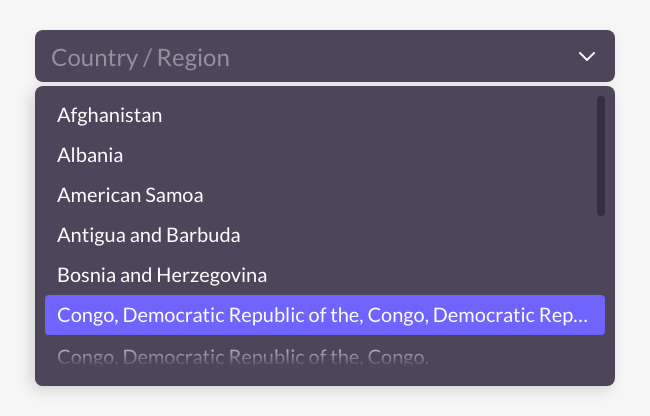
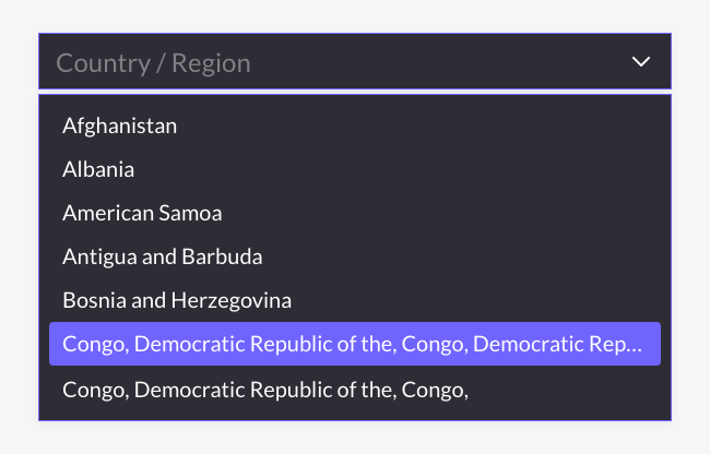
Drop-down list - Color and corner radius can be adjusted, ensure that the top corners match the drop-down box when adjusting corner radius. Resized through 9-slice scaling.
- Standard:
- Angled example:
Checkbox - Resized through same size replacing, no style restrictions. Provide according to the specified dimensions.
Image button - Resized through 9-slice scaling. Image buttons are commonly used and often require being resized to different widths, and may be easily distorted if a pattern is included. It is advised to use only solid colors or vertical gradient styles.
- Standard:
- Vertical gradient example:
Decorative icon - Resized through same size replacing, no style restrictions. Provide according to the specified dimensions.
Functional icon - Resized through same size replacing, no style restrictions. Provide according to the specified dimensions.
Toast - Resized by stretching horizontally, solid colors or horizontal gradient styles are recommended. Provide according to the specified dimensions.
- Standard:

- Other style examples:

Channel cards - Refers to the third-party channel buttons in the login panel, corner radius can be adjusted, background image resized through proportional scaling.
As the various third-party channels have their own design specifications, we advise using the default colors in order to avoid issues with the product release. If you wish to adjust other aspects of the style, ensure that the style follows the design specifications of the respective channel.
- Standard:
- Angled example:
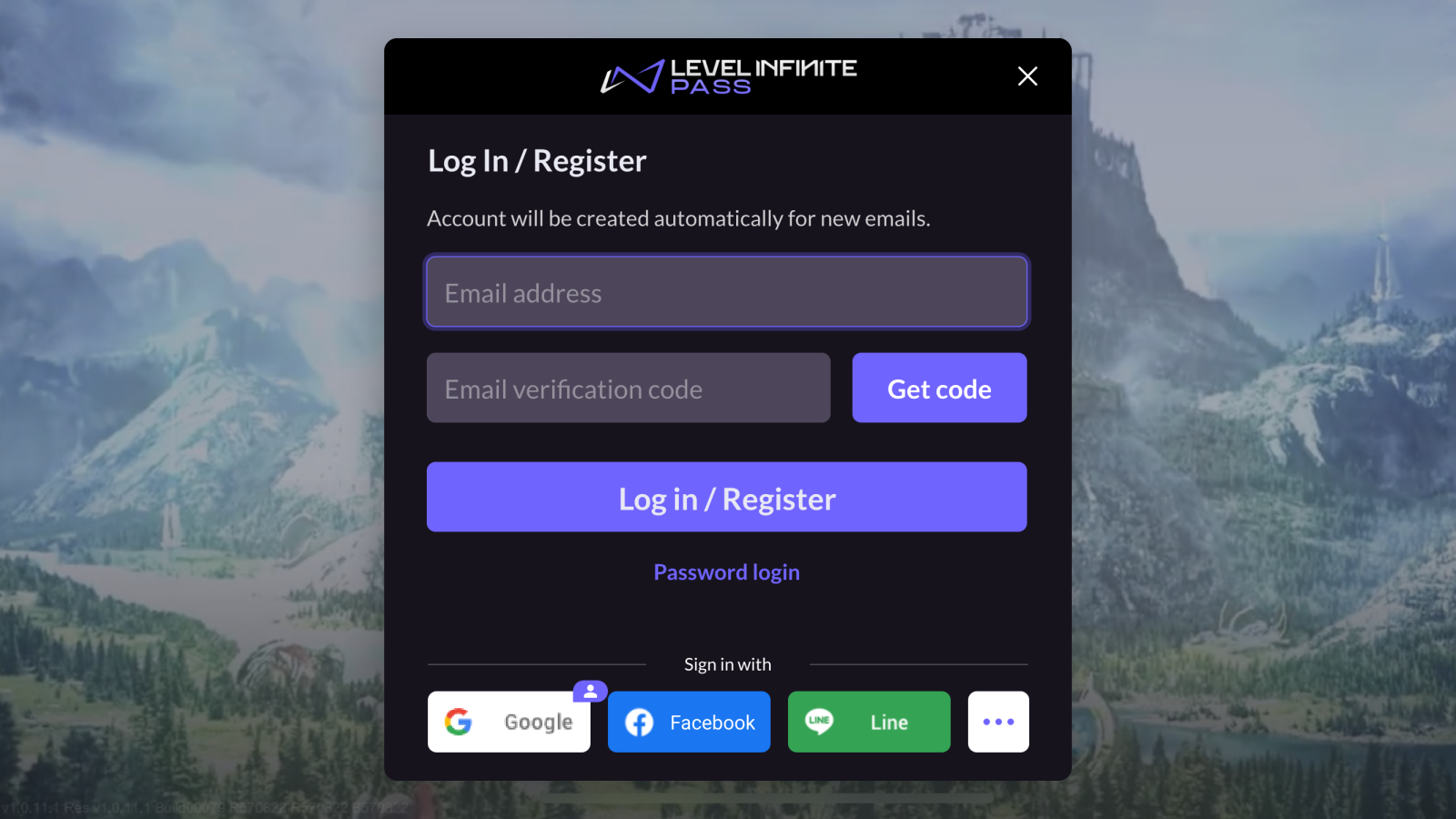
Image processing techniques
When resizing UI images, different processing techniques are employed based on the usage scenarios. The following guidelines may prove to be useful when generating image resources:
-
Same size replacing: Replace images according to size, suitable for small images such as decorative icons and functional icons.
-
Proportional scaling: Stretch images proportionally to different sizes, ensuring that the image remains undistorted. This is suitable for simple images with fixed dimensions, such as main background patterns.
-
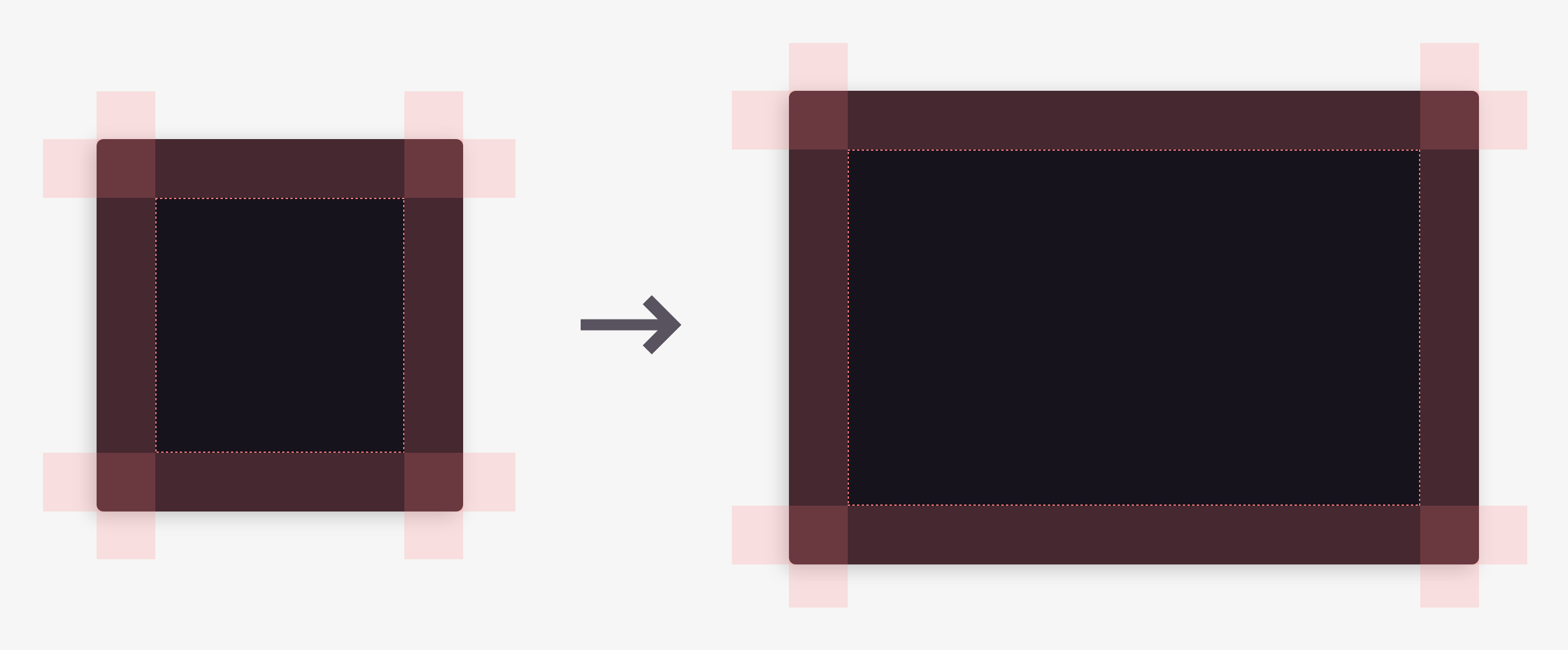
9-slice scaling: Divide the image into a grid of 9 parts and apply different scaling techniques to each part, to adapt to different size requirements.
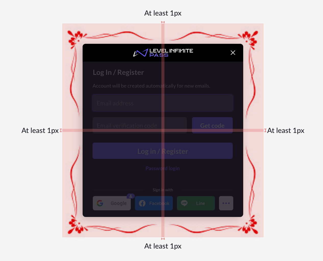
This is suitable for images with complex exterior styling (such as borders, corner badge) and simple interior styling (such as solid colors, vertical gradients) that often have to be stretched to different sizes, such as the title bar and image buttons.- Patterns at the four corners should not intersect.
- A single pattern should not exceed the midpoint.
- Maintain at least 1px of space in between two adjacent patterns for stretching.
